 |
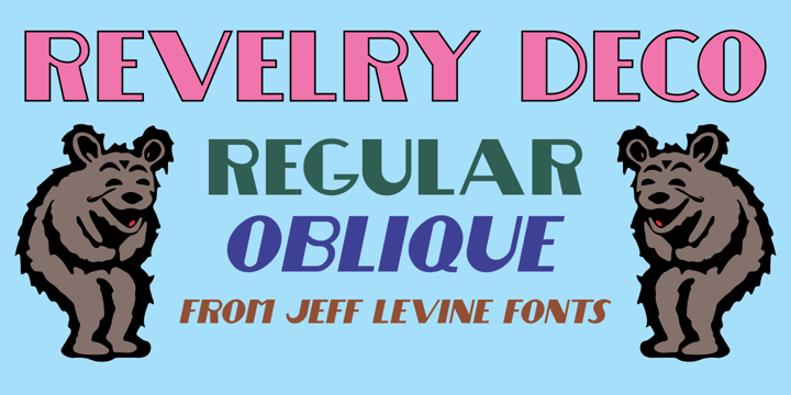
The namesake for this type design was the dust jacket for the 1926 book “Revelry”.
A classic Art Deco thick-and-thin design, Revelry Deco JNL is available in both regular and oblique versions.
 |
The namesake for this type design was the dust jacket for the 1926 book “Revelry”.
A classic Art Deco thick-and-thin design, Revelry Deco JNL is available in both regular and oblique versions.
 |
“One Hundred Alphabets for the Show Card Writer” was published in 1919 to afford sign artists the ability to create signs and show cards in then-contemporary lettering styles.
One such alphabet was big, bold and representative of the Art Nouveau stylings popular in the early part of the 20th Century. Most likely it was applied to store sales and public events that were casual and informal, for its letter forms are free of any constraints.
This design is now available as Fun Time Nouveau JNL in both regular and oblique versions.
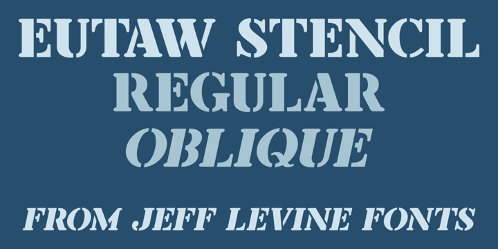 |
A hand lettered emulation of a Roman stencil type face on the cover of the folio for the Stenso School Set was the basis for Eutaw Stencil JNL, which is available in both regular and oblique versions.
The Stenso School Set (circa 1940-41) was comprised of three stencils – two lettering guides and a map of the [then] 48 United States.
Developed and patented by Baltimore school teacher Ruth Libauer Hormats, her stencils were the first to offer a system for accurate letter spacing and ease of use.
“Eutaw” (as part of the font’s name) is taken from Eutaw Place, the street where Ruth and her husband lived at the time of Stenso’s inception. To the Cherokee, the name means “Creek Indian”.
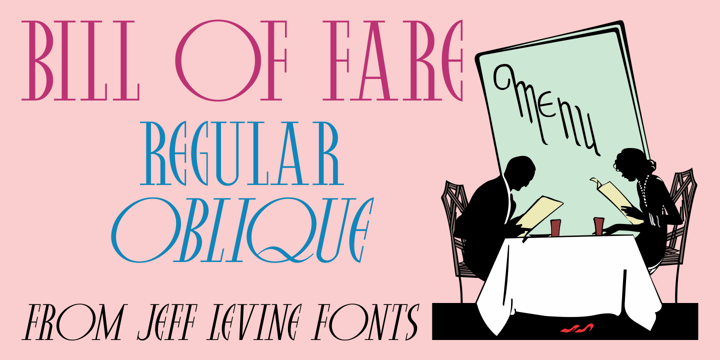 |
A 1942 menu cover for the restaurant at the Biltmore Hotel in Los Angeles features its name in a stylized Art Deco serif design.
This is has been turned into the digital typeface Bill of Fare JNL, and is available in both regular and oblique versions.
 |
Hi...Thank for your visit :)
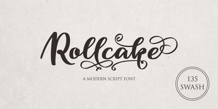
Rollcake Modern Script Fonts are font designs that are made for various vector designs, printing such as digital wedding invitations, blogs, online shops, social media, while printing can be used in the field of product clothing, accessories, bags, pins, logos, business cards, watermarks and many others ...
Rollcake is equipped with complete alternates and very beautiful ligature, so it can make your product look elegant and attractive,
and also Multilingual support!!!
Happy design ...
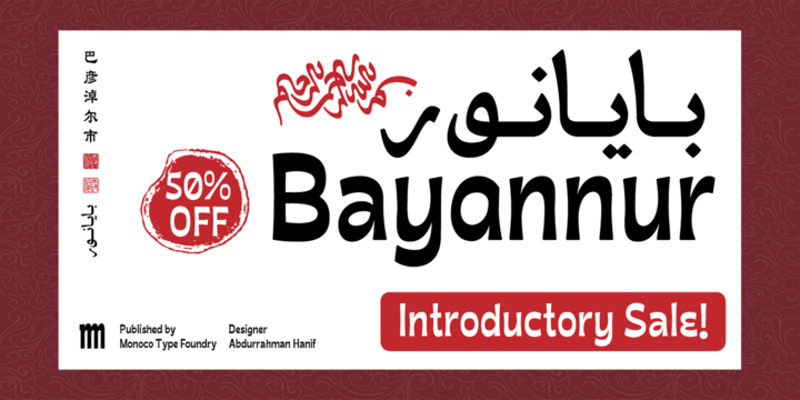 |
Bayannur is a typeface published by Monoco Type Foundry inspired by Arabic Calligraphy in Chinese Tradition. This font has extensive Latin script support with many ligatures and stylistic sets, as well as Cyrillic and unique Arabic design with contextual alternates and many ligatures. The glyphs in this font also specifically support Uyghur script typing*. Abdurrahman Hanif, designer based in Jakarta, is currently studying Arabic Calligraphy in Chinese Tradition with Haji Noor Deen and trying to develop this font as his appreciation for this beautiful Art of Calligraphy.
 |
Want to transport your audience to a world of wonder with your branding? Want your headings to spark happiness and engagement?
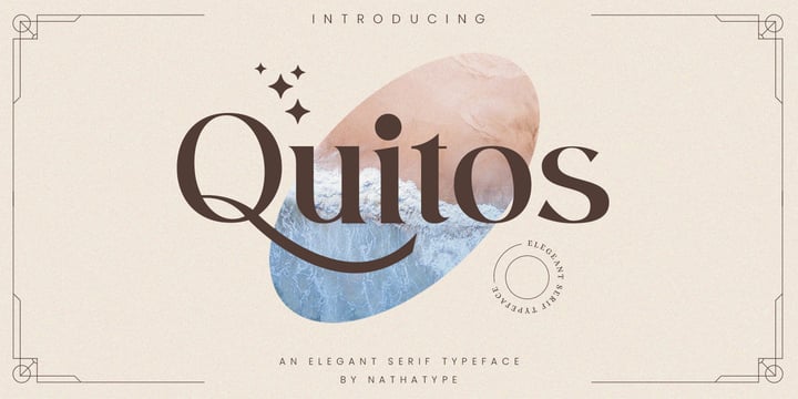
Quintos-Serif Font
A modern and elegant serif font that’ll make your audience swoon and enhance your branding projects, printed materials, and website design. This font was created to bring out modernity and style. Ideal for social media banners; posts, and ads, printed quotes, t-shirt designs, packaging, or even as a modern text overlay to any background image.
Features:
Thank you for downloading premium fonts from Nathatype
 |
Hi...Thank for your visit :)
Rollcake Modern Script Fonts are font designs that are made for various vector designs, printing such as digital wedding invitations, blogs, online shops, social media, while printing can be used in the field of product clothing, accessories, bags, pins, logos, business cards, watermarks and many others ...
Rollcake is equipped with complete alternates and very beautiful ligature, so it can make your product look elegant and attractive,
and also Multilingual support!!!
Happy design ...
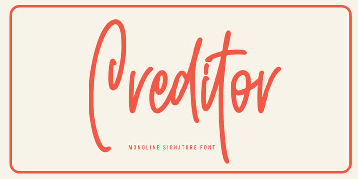 |
Creditor - Monoline Signature Font that has a distinctive character that is very thick and elegant to use
Creditor is a relaxed and flowing Handwritten Font. Incredibly versatile, this font fits a wide pool of designs, elevating them to the highest levels. Add this font to your favorite creative ideas and notice how it makes them come alive!
Features : • Character Set A-Z • Numerals & Punctuations (OpenType Standard) • Accents (Multilingual characters) • Ligature
Multilingual Support : Afrikaans, Albanian, Asu, Basque, Bemba, Bena, Catalan, Chiga, Cornish, Danish, English, Estonian, Faroese, Filipino, Finnish, French, Friulian, Galician, German, Gusii, Icelandic, Indonesian, Irish, Italian, Kabuverdianu, Kalenjin, Kinyarwanda, Low German, Luo, Luxembourgish, Luyia, Machame, Makhuwa-Meetto, Makonde, Malagasy, Malay, Manx, Morisyen, North Ndebele, Norwegian Bokmål, Norwegian Nynorsk, Nyankole, Oromo, Portuguese, Romansh, Rombo, Rundi, Rwa, Samburu, Sango, Sangu, Scottish Gaelic, Sena, Shambala, Shona, Soga, Somali, Spanish, Swahili, Swedish, Swiss German, Taita, Teso, Vunjo, Zulu
There it is! I really hope you enjoy it
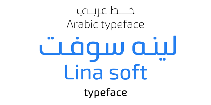 |
Lina soft is an Arabic typeface from Lina-type family, with a warm and humane feeling. It's legible, soft, clear, flexible, simple, and contemporary. With a handful set of OpenType features and alternatives.
Lina type family consists of Lina soft, Lina sans, Lina round.
The design is inspired by the Kufic calligraphic style and influenced by the Naskh style.
Lina soft was highly crafted in order to perform well both on screen and in print. The large x-height and open counters make it function well even on small font sizes.
It has a wide range of use possibilities headlines, logotypes, branding, books, magazines, motion graphics, and use on the web and Tv.
Lina Soft consists of 7-weight versions from thin to bold.
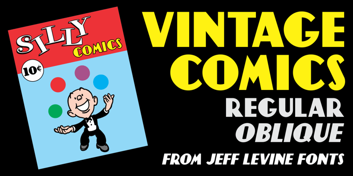 |
Vintage Comics JNL was inspired by the way the word “comics” was hand lettered on many of the comic book covers of the 1940s, and is available in both regular and oblique versions.
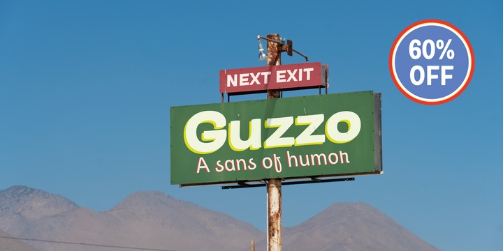 |
A playful caricature of a midcentury grotesque, Guzzo is a fresh addition to the Monotype Library. Somewhat eccentric and full of surprises, its unmistakable quirk can be found on closer inspection, stemming from details proudly borrowed from brush lettering and calligraphy.
The wide range of weights and style can take you through any design space, from the condensed weights squeezing in larger headlines or dense blocks of text with the condensed range, to experimenting with small point sizes, labels or packaging with the extended cut. However, Guzzo’s real charm is probably best expressed through its wonderfully playful shapes, its unusual 'laid-back italics' feature cursive forms and a backslant. The different stylistic sets allow you to decide what you make of Guzzo, with several sets of alternate glyphs steering it in any direction you want.
Guzzo is a happy-go-lucky character, and has a warm, humble and painterly quality that - at a glance - may be unrecognizable as a typeface. It can almost pass for hand-lettering. Guzzo pairs exceptionally well with scripts and slab typefaces, and feels most at home in situ with toys, packaging, menus, broadcasting, cartoons and merchandising! Guzzo encourages you to turn up the silliness and is for designers who want to emulate hand-painted and casual motifs.
Taking its name from American artist Jeremy Pinc, aka the painter Guzzo Pinc, the typeface channels the quirky, funny and poignant qualities of his paintings - with wacky characters, loosely painted geometric forms and bright colors.
For this mid century, authentic, nostalgic typeface - the story is really what you make of it.
Subscribe For New Post Notifications