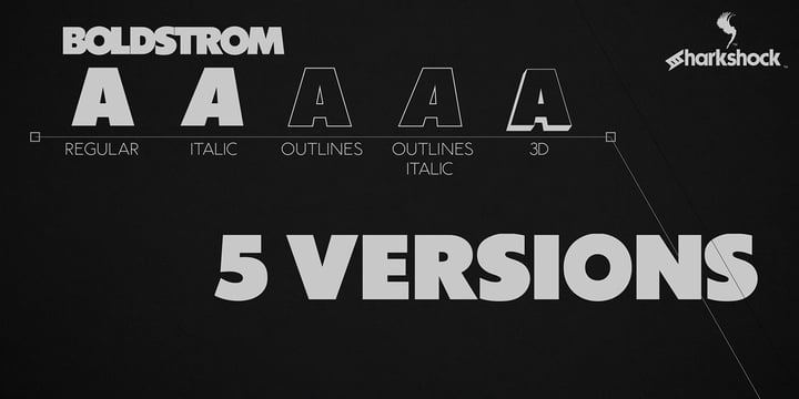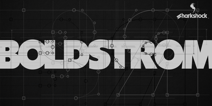
Boldstrom is a heavy-handed, all caps, display font available in 5 versions. Emphasis was put into strong line weight, minimal contrast, and tight curves. This family is defined by very broad stems with comparatively thinner cross strokes. Spacing was condensed to ensure the characters fit snug against one another. This was done in part to minimize negative space while also creating tension. The result is a powerful looking sans serif designed to command attention and make a statement. Boldstrom will be best used in large format print, titling, books, movie posters, or company logos.
Showing posts with label curves. Show all posts
Tuesday, October 20, 2020
October 20, 2020
BY
Fika
0
Comments
Wednesday, March 4, 2020
March 04, 2020
BY
Fika
0
Comments
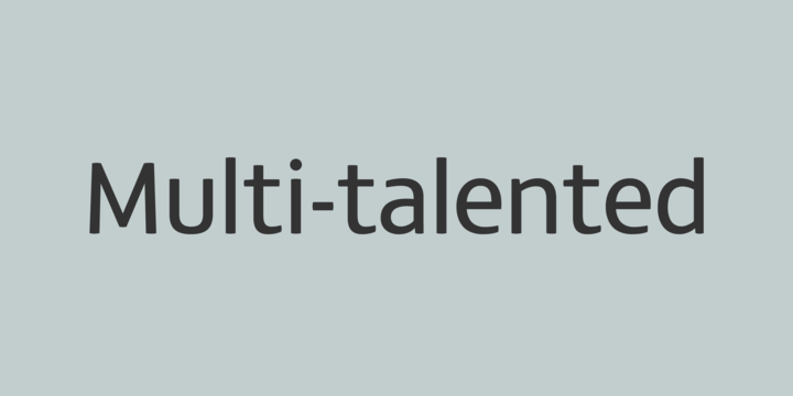
FS Matthew is a multi-talented typeface.
A clear, stylish and structured sans serif with swooping curves of openness which create a lively, flavourful character. Unexpected drama in details such as the reaching curve of the g and y, the shape of the u, and the off-kilter k, v and w all
build-up the fonts character. Generous counters and a slightly condensed aspect come together to make it very legible and space-saving in text or title sizes. A structured system for solid corporate identities, signage systems, logotypes, screens, websites and billboard ads. An all round multi-talented font with a feel-good factor – radiant, efficient and sound.